

 Today I’m going to discuss covers and design. A hugely important aspect of self-publishing is creating (or paying someone else to create) a cover that conveys what your book is about and entices readers to click it, download it and even perhaps pay for it.
SIZE AND FORMATS
First off, the basics. Amazon currently recommends a minimum of 625 x 1000 pixels and for best results suggests that the longest side should be at least 2500 pixels. Assuming a 1:1.6 ratio, that means the short width would be 1562 pixels (or thereabouts). Amazon book covers can be uploaded as either jpeg or tiff files.
Apple iBooks currently suggested a minimum width of 1400 pixels in 2012, but Apple appear to be cagey about recommending anything definite at this moment. It’s surprisingly difficult to find a straight up and down answer to the simple question: what is the ideal size for an iBook cover? Steve Sagovac at Popgun Pocketbooks recommends a cover size of 768×1004 pixels. Let’s scale this up to the minimum of 2500 pixels tall that Amazon requires. It’s a safe bet that file sizes are going to increase not decrease, so it’s probably a good idea to work with something around about 2500 height if possible.
A size of about 1371×2500 for iBooks and 1500×2500 for Kindle seem about right then. You could of course just opt for one or the other size for both and accept that the image will not be perfect on the other platform but if you can create a cover for each platform you should.
Example of 1371×2500 (iBooks)

Example of 1500×2500 (Kindle)

WHAT ABOUT COVER DESIGN SOFTWARE?
My personal advice is to avoid using the online Kindle design app or any other prepackaged designs. You’ll end up creating a cover that looks more or less like every other cover designed using the same app. It’s better to create your own cover design and upload the file as a jpeg / tiff (Amazon) or jpeg / png (iBooks).
In terms of other software to use, Photoshop would be my choice except that much like half the internet I’m leery of Adobe’s recent move to the creative cloud. I like to be able to own my software, not rent it in perpetuity. GIMP is the go-to free to use acceptable Photoshop alternative but I’ve never been a huge fan of GIMP. No good reason.. I’ve just never taken to it. As such I went hunting for other alternatives. Most of my suggestions are going to be Mac-only. Apologies to users of other operating systems. I work on a Mac and most design work is done on Macs, so perhaps my first piece of advice is consider moving to a Mac… that said, I investigated Affinity Designer (Serif Labs) and Sketch (Bohemian Coding). These are both functional design programs, but they are vector programs that replace Illustrator rather than Photoshop. A solid Photoshop replacement is hard to come by and I’ve ended up arriving at combining Pixlr (Autodesk), SketchBook (Autodesk) and Logoist (Synium Software) for my purposes.
I should note that I’m actually very impressed by Logoist for the purposes of book cover design. It is intuitive and powerful. My feeling is that even someone who doesn’t have a lot of design experience will be able to turn out a reasonably attractive looking cover using Logoist. The software is intended to allow people to design professional looking logos but the functionality stretches to book covers without a problem.
MOCK UPS AND SKETCHES
One of the best ways to avoid looking like an amateur is to spend some time browsing the covers of popular books both in the Kindle and iBooks stores and do some sketches of ideas before you commit to anything. Different genres have expectations around design. Horror will tend to be black and red. Romance will use fun fonts and brighter colours, sometimes pastels and often photography instead of artwork. Literary fiction will tend towards smaller font sizes on the cover, simpler fonts and more minimalist designs. Fantasy and science fiction like to splash big imaginative and colourful artwork all over the cover. Here are some other basics:
- Midlist authors and new authors in the publishing industry will tend to get a big title midway up the cover and a (much) smaller font size for their name. This is because the industry feeling is that if a reader has never heard of an author, then the name is meaningless. A big name in a huge font above the title is only useful once you are well known.
- Simpler fonts are often better. There are plenty of fancy, decorative or degraded fonts available – many of them are quite attractive – but remember that your book image will be reduced to a much smaller size for browsing. If you look through the books produced by professional publishing houses you will see very few elaborate fonts, and most of the decorative fonts are digitally drawn by a professional to spec rather than just typed in using a fancy font.
- Pay for your artwork. Seriously people. Don’t expect art to be free. Don’t go to a graphic design forum and ask for free art in return for ‘exposure’ for a struggling artist. Artists need to eat too and you need to pay a fair price. Artists are not going to try and cheat you on price either. The more you pay the better the artwork is likely to be. You can get colour cover art for anywhere from US$250 to US$1000 (or more). More established artists will ask for more. Also, if you insist on paying the least possible amount of cash, the artist will spend the least possible amount of time on the job. Keep that in mind.
- As a supplementary rule to this, unless you know a real bone fide working artist, don’t get your cousin, sister’s husband or friend’s friend to do you art for you. Amateur art stands out a mile and screams amateur book.
- Finally, write a good book. Worry about the cover only once you have a good book. A really gripping read with a ton of good reviews and good word of mouth will sell your book much better than excellent cover artwork. Great art and cover design will help get people to click on your work to read the blurb and reviews but it won’t guarantee a sale.
LET’S CRITIQUE SOME COVERS
I typed ‘free epic fantasy’ and ‘free crime’ into iBooks and have grabbed screenshots of some of what came up near the top of the search results. We’ll start with the crime:
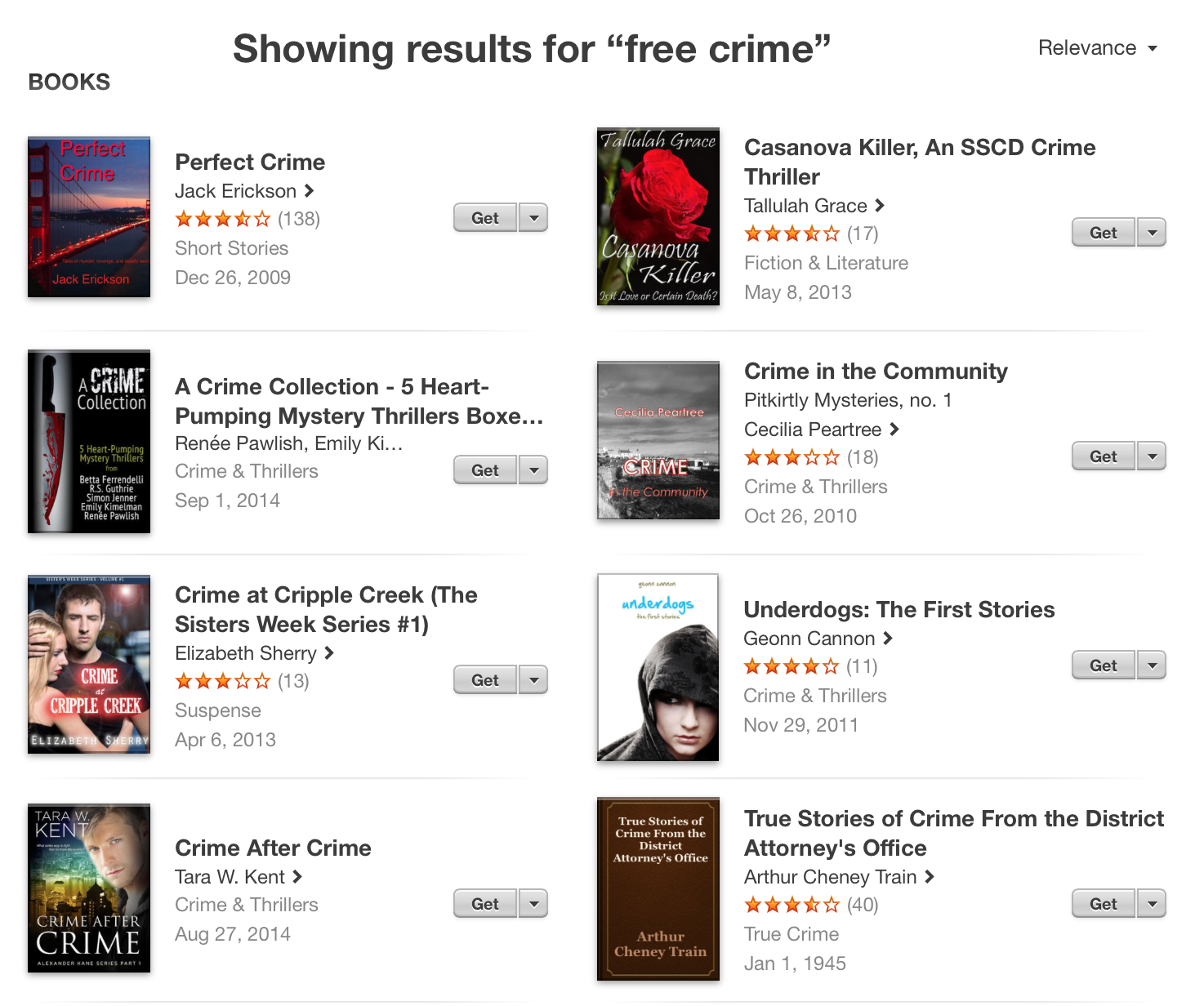
All of these covers say self-published to me, but that’s ok. Self-published doesn’t have the stigma it once did. I’m totally happy to have a punt on a self-published work. Of the above covers Crime After Crime by Tara W. Kent is the most professional, although Underdogs by Geonn Cannon isn’t bad, and A Crime Collection actually looks like small press rather than self-published effort at first glance. Perfect Crime by Jack Erickson looks as if it was done in PowerPoint using a stock photo, but has the advantage that the font is easy to read. Casanova Killer and Crime in the Community both look somewhat better than Perfect Crime. In both these cases someone has put some effort into balancing out the placement of text and leaving enough negative space for the text to not feel awkwardly placed. Crime at Cripple Creek isn’t terrible. The key problems are that the author’s name is a light font on a light background (hard to read) and glowing outlines need to be treated with more more subtlety. True Stories of Crime From the District Attorney’s Office actually appeals to me on the basis of straight up and down honesty. This is clearly not professionally designed and it’s not pretending to be.
One other thing to take away from this brief examination is that red lettering on a photographic background seems to be a signal that says ‘crime novel’. Worth being aware of. You want to make your cover as transparent as possible in terms of who the story is for.
Let’s look at the free epic fantasy…

These are somewhat better overall but there are still problems and some standouts and less than stellar attempts. Seer’s Hope is actually quite nicely done except that the font could benefit from being simpler and maybe all caps too. Taming Fire has a nice illustration but the red decorative font is unreadable. The Book of Deacon and The Broken World Book One: Children of something or other fall into the same category. Nice artwork. Poor choice of font and colour. Children of something or other suffers especially because the title is so long that we can’t read it all. Yes, the title is right there next to the book but I tend to find that I look at the cover first and the text title second. You might as well make a good impression with the cover. I’m on the fence with The Queen’s Blade. One the one hand, the font is illegible and far too thin, on the other hand, it does look like it is pushing into the realm of professional design and many pro publishing houses use illegible fonts for fantasy epics too. Go figure. The Unsuspecting Mage looks like another PowerPoint job… and the photo is both awkward and unprofessional looking. All of the remaining titles are professional enough to trick my eye into thinking they might be from a medium to large press. Blood of Requiem is striking and the title readable. Legend of the White Dragon and Fire & Ice have nice artwork and are readable. Airel is also striking and feels like a modern YA cover. All of these are well designed and distinctive.
This is what you are aiming for with cover design:
- Readable title and name
- Aesthetically pleasing design including good use of negative space, use of colours and professional artwork
- Distinctive: especially in a series you ideally want to ‘brand’ the work so that they are all clearly a part of the same series and/or by the same author.
BUT A BAD COVER WON’T SINK YOUR MASTERPIECE
Even where the cover looks like the author did it themselves, in PowerPoint, distracted, while catching up on The Walking Dead in the background, even then, those books I’ve screen-grabbed above are super-successful. They have good ratings and a swag of positive reviews. Would a frankly awful cover stop me from reading The Unsuspecting Mage or T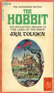 he Perfect Crime? No. Of course not. Both these books have a solid backing of top reviews.
And I want to end my critique on this point. If you’ve read all this and thought to yourself but I can’t do a professional cover and I can’t pay anyone to either don’t let this stop you. Good writing sells in the end. If you want proof, here is the first US edition cover of The Hobbit. First, the design is awful and second: are those emus? Is that a lion? What is that tree with the strange fruit? What does that have to do with anything in the book? What the–?
But The Hobbit was not exactly an unsuccessful work. A good cover only ever helps. In the end, good stories transcend ordinary and even very bad covers. Don’t worry if you don’t have a design degree. Go forth and self-publish.
Next in the series we’ll be looking at possible fonts for your cover.