

 COVER DESIGN, LAYOUT & PIXEL DIMENSIONS
This is the second of my cover design posts. In my first post, a while back now, I undertook a bit of an investigation into the dimensions of book cover images that are most suitable for the largest two markets, Amazon Kindle and Apple iBooks. I’m going to elaborate on this, explaining how I’ve approached cover design and why I made the choices I made.
First of all, the dimensions. I settled on a slightly larger pixel size than is the absolute minimum in an attempt to ‘future proof’ the image quality. A the screen quality of e-readers improves, smaller cover images will start to look pixellated and fuzzy over time. Eventually I settled on:
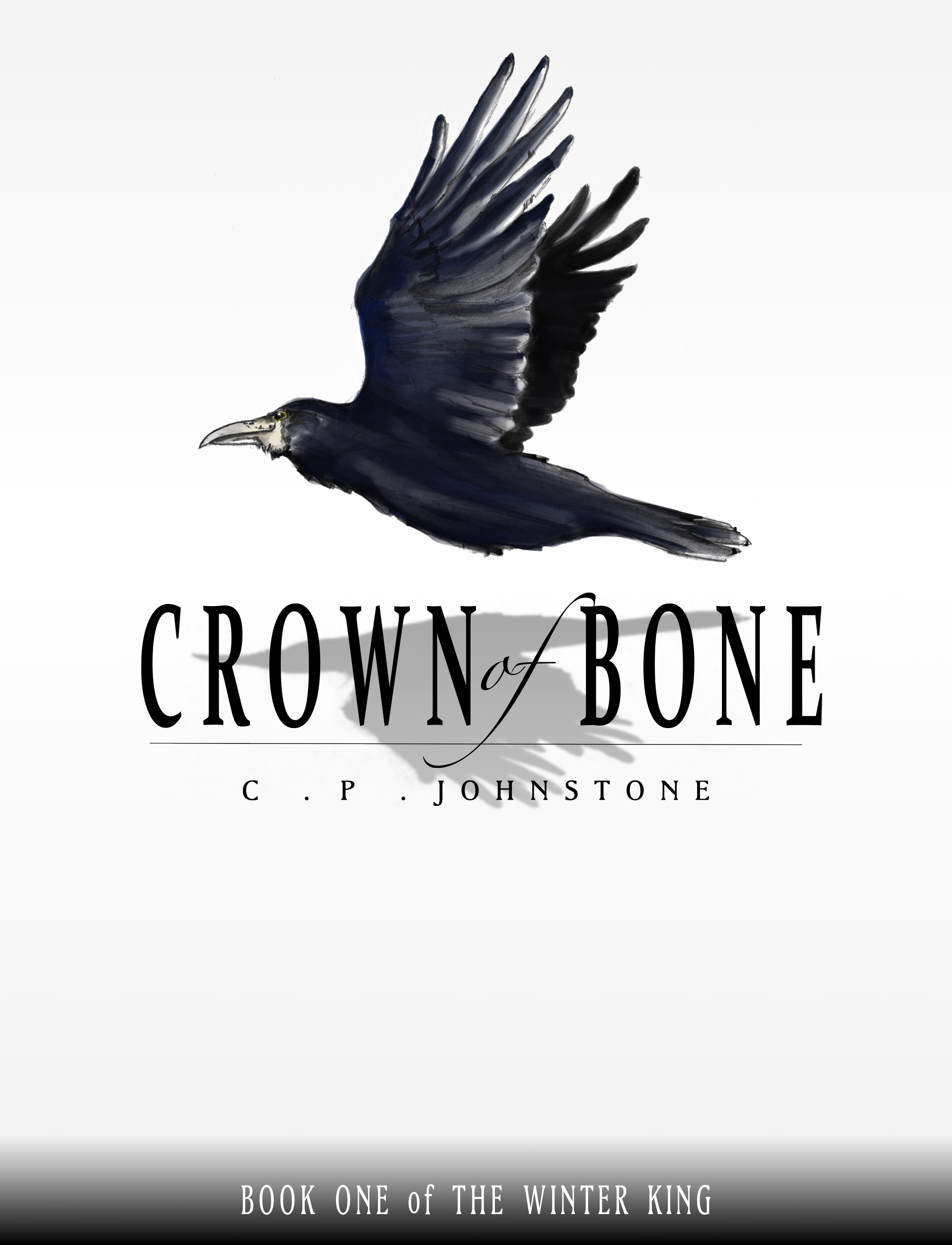
1912 x 2500 pixels for iBooks (including Smashwords)
1562 x 2500 pixels for Kindle
COVER ILLO & DESIGN STARTING ADVICE
The most basic advice that you will hear over and over is that unless you are actually a professional artist, you should pay someone to do cover art. Don’t expect to have some artist agree to do your cover for free (artists need to eat too), and doing the art yourself risks looking amateurish. That said, there is actually quite a lot of free to use with modification photography and artwork lying around the internet, so that is also an option. However, keep two things in mind 1) typically, free to use with modification artwork requires an acknowledgement of the art source with a link-back to the original site, so plan to include that somewhere in your book, and 2) it’s better not to just grab some art and run it through photoshop filters – it looks unprofessional.
And you do want to look professional.
The second piece of advice you will hear a lot is that even if you decide to do your own artwork, or get hold of some public domain art, then you should pay a graphic designer to do your layout. Again, this is just a matter to trying to produce something that looks professional.
Remember that the cover is the first (and potentially last) impression your book will make on a possible reader browsing through an ebook store. For this reason, it is important to at least give the impression of putting some care into your work.
So, did I do this? Well, no. I didn’t actually take my own advice, so I’m not sure how seriously you should take me… that said, I am doing this all as a bit of an experiment, and I’m giving away my first novella length ebook for free (here and here), so I wasn’t very keen to spend a lot of cash on something that is (thus far at least) effectively a donation to the world at large.
You can judge for yourself whether I made the right decision here. I’ve produced two covers so far, and I’ve pasted the cover-work below so that you can see what I created. Before creating the covers, I spent some time looking through covers of books in similar categories (epic fantasy, YA fantasy). The main problems I identified were:
- Maybe the cover would look fine full size, but as a thumbnail it was unreadable
- Colours of fonts and background were too close and hard to read
- Artwork wasn’t very stand-out or distinct from the other similar looking covers
I attempted a few things to try and combat this…
- Keep the cover design super simple: black text on white
- Use a single image of an animal (or similar) rather than a busy scene
- Make sure the font was readable even at a very small size
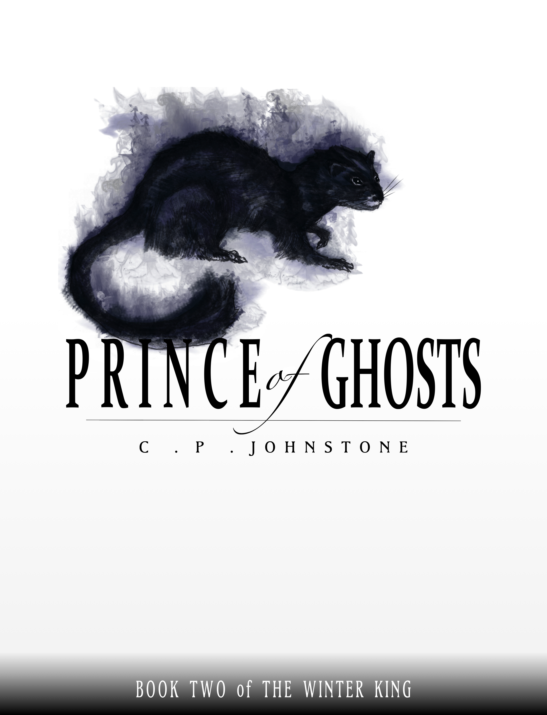
The process I went through was to sketch a feature illustration on paper and scan it at 300 dpi. I then coloured it by using a combination of Corel Paint and Adobe Photoshop, and converted the image to a tiff. For cover design I used Logoist 2 (which I can’t speak highly enough of for basic design uses), dropped the image in, added text, played around a bit, created about a dozen variations and showed them to friends and family until I had a clear favourite. This was the outcome:
1912 x 2500 pixels for iBooks (including Smashwords)
(click to embiggen)
1562 x 2500 pixels for Kindle
(click to embiggen)
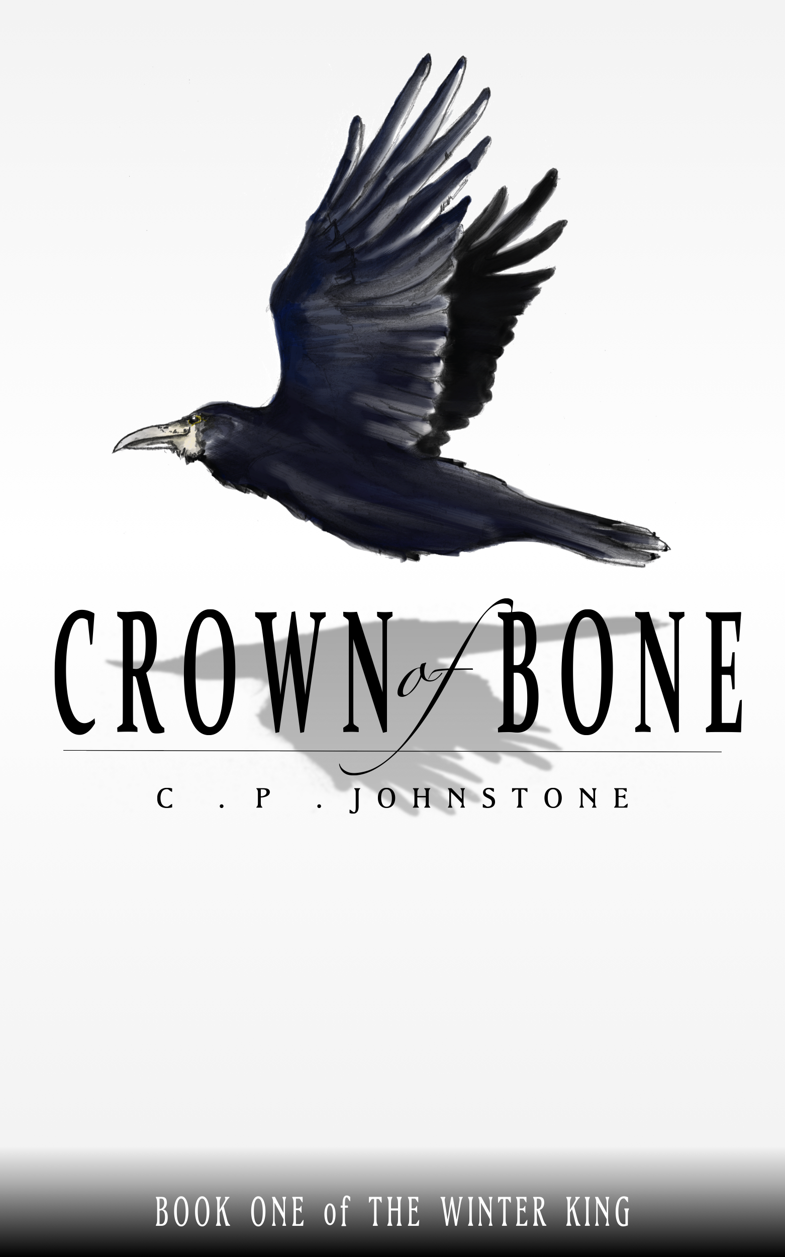
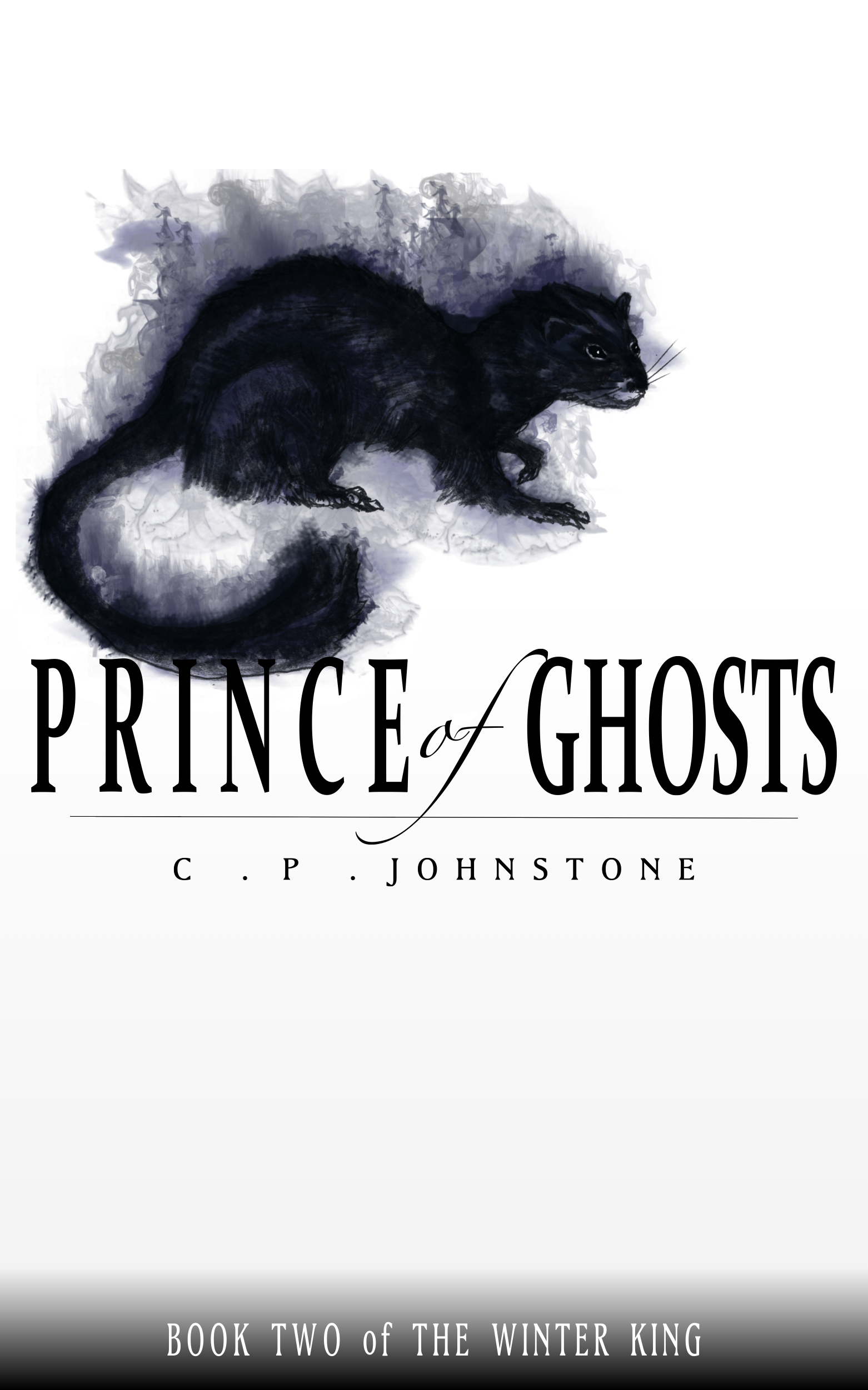
To my eye, it is obvious that neither of my two efforts are highly professional. No publisher would release books with those covers, but, I feel they are respectable self-publishing efforts. Nothing too fancy, nothing too confusing, and most importantly, easy to read and clearly part of the same series, even at a glance. As a part of making the books visually coherent in that regard, I’ve decided that all the books in the series will have a single animal (or something that looks like an animal) as the feature art with a bit of decorative stuff like a shadow or something else around them. I achieved the smoke effect on the Prince of Ghosts cover using smoke Photoshop brushes from Obsidian Dawn, who allows you to use brushes for free as long as you link back. (See what I did there?)
I’ll probably lay down $20 or $30 to buy some professional Photoshop brushes before playing around with the cover for the third book. I’m already pushing the boundaries of my ability to do something illustrative using digital programs and a basic digital stylus and tablet.
That’s about all I want to mull over for now: the basic advice here is that if you’ve sweated and worked hard to produce the best book you could, then you shouldn’t undercut yourself by wrapping it in poorly painted or poorly designed cover-work.
The next post in this series will be about my experiences posting the finished novella to the Amazon Kindle Store and Smashwords, problems I ran into, and tricks and tips I learned to overcome them.